Fuentes (tipografías) interesantes para línea de comandos (CLI) y para programación
(*) instalar demasiadas fuentes afecta al rendimiento del sistema
Muchas de las fuentes que se enuncian a continuación se pueden visualizar y comparar en la página web Font PlayGround.
‘IBM Plex Mono’
‘IBM Plex Mono’
descargar ‘IBM Plex Mono’
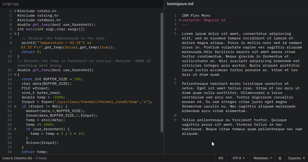
‘IBM Plex Mono’
«Meet the IBM Plex® typeface, our new corporate typeface family. It’s global, it’s versatile and it’s distinctly IBM.
We designed the IBM Plex typeface carefully to both meet our needs as a global tech company and express who we are as IBMers. It took two years and a lot of work to get here, but today we have a signature typeface we’re proud and excited to share with the world. Discover more about our development of the IBM Plex typeface.
The IBM Plex typeface is an open-source project and available for download and use following the Open Font License (OFL). The IBM Plex family comes in Sans, Serif, Mono and Sans Condensed, all with roman and true italics. The fonts have been designed to work well in user interface (UI) environments, as well as other mediums. This project provides all source files and file formats to support most typographical situations. Currently, IBM Plex Sans supports Extended Latin, Arabic, Cyrillic, Devanagari, Greek, Hebrew, Korean and Thai. Japanese and Chinese will follow in 2021 and 2022.»
‘Anonymous Pro’
‘Anonymous Pro’
descargar ‘Anonymous Pro’
descargar ‘Anonymous Pro minus’
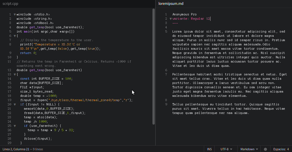
‘Anonymous Pro’
Diseñada en 2009 con la idea en mente de ser usada para programar, se basa en algunas fuentes anteriores como:
- la fuente ‘Anonymous’ diseñada en 2001
- una versión anterior llamada ‘Anonymous 9’ (del propio diseñador de ‘Anonymous Pro’)
- una fuente bitmap de Macintoch de mediados de los 90’s.
‘Anonymous Pro’ es una fuente de ancho fijo que tiene caracteres redondos y curvos, de fácil lectura y que puede adaptarse a cualquier tamaño.
«Anonymous Pro (2009) is a family of four fixed-width fonts designed with coding in mind. Anonymous Pro features an international, Unicode-based character set, with support for most Western and Central European Latin-based languages, plus Greek and Cyrillic. Anonymous Pro is based on an earlier font, Anonymous™ (2001), my TrueType version of Anonymous 9, a Macintosh bitmap font developed in the mid-’90s by Susan Lesch and David Lamkins. Anonymous Pro is distributed with the Open Font License (OFL).
There are two versions: Anonymous Pro and Anonymous Pro Minus. Anonymous Pro contains embedded bitmaps for smaller sizes, Anonymous Pro Minus does not. More info about this in the Usage Notes.»</small>cd ~/Descargas unzip AnonymousPro-1.002.zip -d ~/.fonts/ -x ._A* *.txt sudo fc-cache -f -v
‘Inconsolata’
‘Inconsolata’
‘Inconsolata’ - google fonts
‘Inconsolata’ - gitHub
descargar ‘Inconsolata’
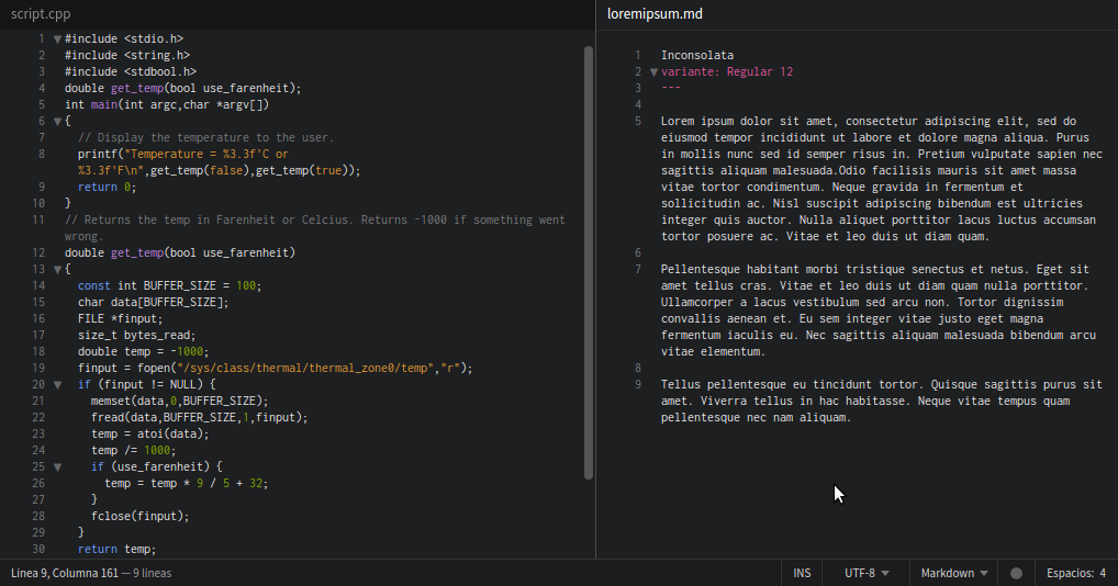
‘Inconsolata’
Incorpora ligaduras, se ve tan bien en pantalla que sobre el papel.
«It is a monospace font, designed for code listings and the like, in print. There are a great many “programmer fonts,” designed primarily for use on the screen, but in most cases do not have the attention to detail for high resolution rendering.
Inconsolata draws from many inspirations and sources. I was particularly struck by the beauty of Luc(as) de Groot’s Consolas, which is his monospaced design for Microsoft’s upcoming Vista release. This font, similar to his earlier TheSansMono, demonstrated clearly to me that monospaced fonts do not have to suck.
First and foremost, Inconsolata is a humanist sans design. I strove for the clarity and clean lines of Adrian Frutiger’s Avenir (the lowercase “a”, in particular, pays homage to this wonderful design), but also looked to Morris Fuller Benton’s Franklin Gothic family for guidance on some of my favorite glyphs, such as lowercase “g” and “S”, and, most especially, the numerals.
Designing a monospace font poses unique challenges. I have carefully studied many other monospaced fonts to see how they solve these problems. Many of the available monospace fonts are adaptations of existing proportionally-spaced fonts, but some, such as Letter Gothic, draw strength from being their own designs. I hope Inconsolata upholds that tradition.
Some details will be most apparent in print, such as the subtle curves in lowercase “t”, “v”, “w”, and “y”. Inconsolata also borrows “micro-serifs” from some Japanese Gothic fonts, which enhance the appearance of crispness and legibility.»
cd ~/Descargas mv Inconsolata.otf ~/.fonts/
sudo fc-cache -f -v
La versión con comillas “rectas” recibe el nombre de InconsolataGO.
‘Input Mono’
‘Input Mono’
descargar ‘Input Mono’
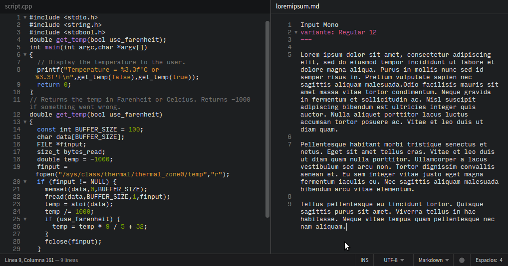
‘Input Mono’
«Input is a flexible system of fonts designed specifically for code by David Jonathan Ross. It offers both monospaced and proportional fonts, all with a large range of widths, weights, and styles for richer code formatting.»
‘M+’
‘M+’
‘M+’ - gitHub
descargar ‘M+’
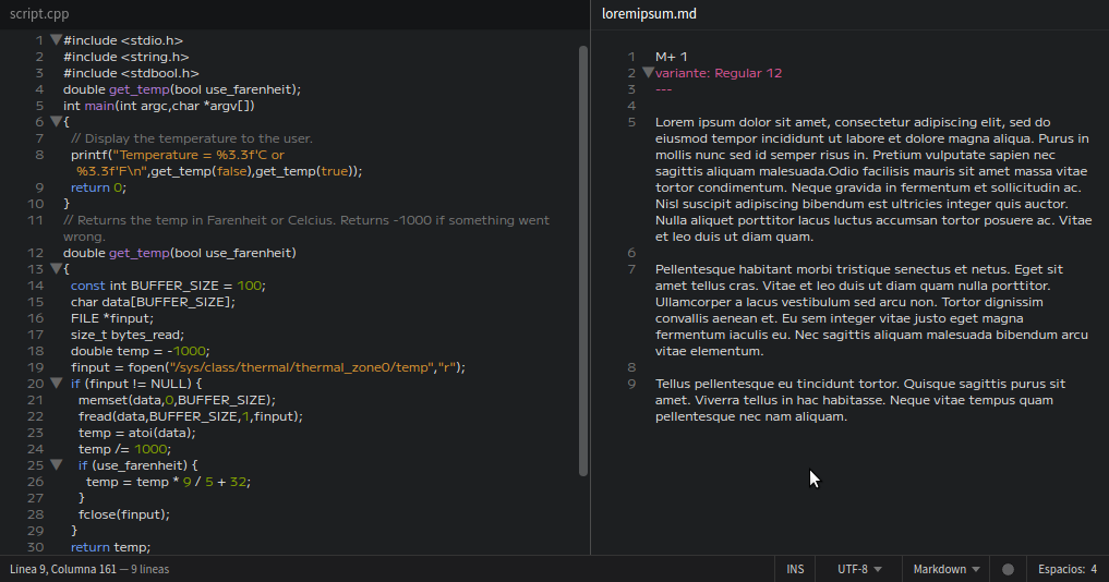
‘M+’
«M+ FONTS are a font family under the Free license. You can use, copy, and distribute it, with or without modification, either commercially and noncommercially»
‘Skyhook Mono’
‘Skyhook Mono’
descargar ‘Skyhook Mono’
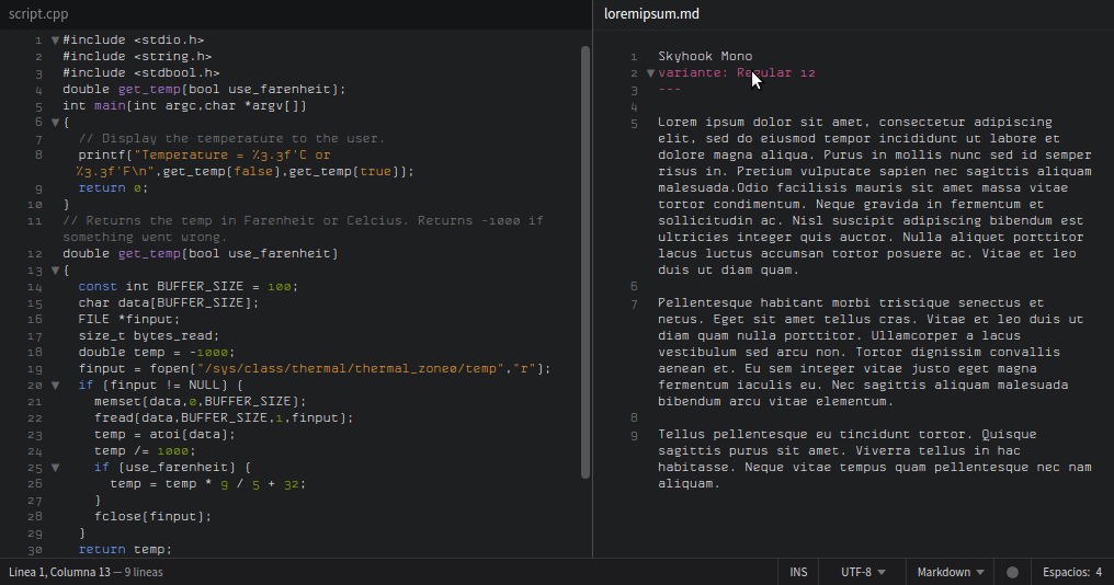
‘Skyhook Mono’
«Sky hook Mono is a care fully hand crafted mono spaced type face fam ily. It is mod ern, sturdy and reduced to the max yet refined and classy. But we really love the fact that Sky hook Mono is very read able even in smaller sizes. It is designed and opti mized to be printed so you shouldn’t be sur prised when the results are even bet ter than the screen appearance!»
‘Ubuntu Mono’
‘Ubuntu Mono’
descargar ‘Ubuntu Mono’
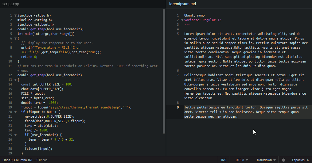
‘Ubuntu Mono’
«The Ubuntu Font Family are a set of matching new libre/open fonts in development during 2010-2011. The development is being funded by Canonical Ltd on behalf the wider Free Software community and the Ubuntu project. The technical font design work and implementation is being undertaken by Dalton Maag.
Both the final font Truetype/OpenType files and the design files used to produce the font family are distributed under an open licence and you are expressly encouraged to experiment, modify, share and improve.
The new Ubuntu Font Family was started to enable the personality of Ubuntu to be seen and felt in every menu, button and dialog. The typeface is sans-serif, uses OpenType features and is manually hinted for clarity on desktop and mobile computing screens.
The scope of the Ubuntu Font Family includes all the languages used by the various Ubuntu users around the world in tune with Ubuntu’s philosophy which states that every user should be able to use their software in the language of their choice. So the Ubuntu Font Family project will be extended to cover many more written languages.»
‘Consolas’
‘Consolas’
descargar ‘Consolas’
descargar ‘Consolas’

‘Consolas’
Propietaria; se instala junto con ‘Visual Studio’ en ‘Windows 7’, por defecto en ‘Windows 8’, ‘Windows 8.1’ y ‘Windows 10’.
«OpenType Layout features: stylistic alternates, localized forms, uppercase-sensitive forms, oldstyle figures, lining figures, arbitrary fractions, superscript, subscript. Consolas is intended for use in programming environments and other circumstances where a monospaced font is specified. All characters have the same width, like old typewriters, making it a good choice for personal and business correspondence. The improved Windows font display allowed a design with proportions closer to normal text than traditional monospaced fonts like Courier. This allows for more comfortable reading of extended text on-screen.
This is a monospaced Sans Serif font that was designed and released by Luc(as) de Groot. The Consolas font is one of the unique design tools found in the Clear Type Font Collection. If you are a person who delves deeply about work at Microsoft, then you are probably no stranger to a set of Microsoft fonts that use Clear Type font rendering technology for popular as well as commercial applications.
There are many Sans Serif fonts that look really simple but are of particularly interested by lots of designers. The reason may be the luxurious, flexible, classy appearance, albeit with a simple but equally sophisticated design. And the Consolas font is also a good example. This striking font is very popular in the programmer’s team. This Sans font is displayed in a monotonous style like a classic typewriter or when using as Monospaced font. So this is probably one of the factors that make this Consolas font more popular than ever.
Consolas font has become very popular and familiar to users of Microsoft products. Especially this Sans Serif font is an integral part of Microsoft Visual Studio 2010, Microsoft Office 2007, and Microsoft Windows Vista.
This Consolas font is similar to Calibri font, it has the OpenType features consists of lining numerals, normal zeros, dotted, and slashed. Along with opportunity shapes for a vast of lowercase characters. Moreover, This fancy Sans font contains the subscript, arbitrary fractions, old-style figures, localized paperwork, stylistic alternates, uppercase-touchy forms, lining figures, as well as superscript.»
‘Meslo LG’
‘Meslo LG’
descargar ‘Meslo LG’
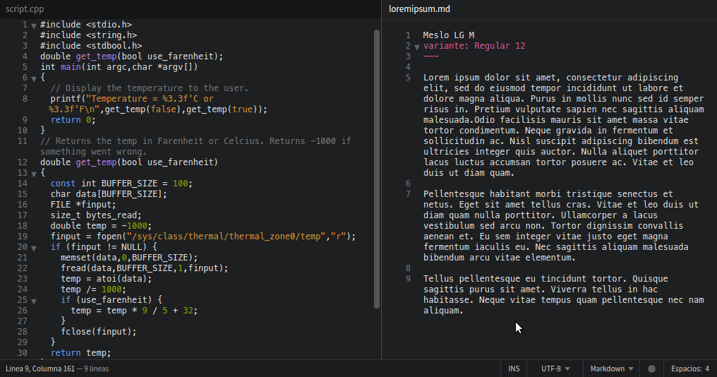
‘Meslo LG’
«Meslo LG is a customized version of Apple’s Menlo-Regular font (which is a customized Bitstream Vera Sans Mono).
In Snow Leopard, Menlo-Regular is now the preferred and default font for Apple’sdeveloper tools and also the Terminal (unless you changed the font settings for these apps yourself before upgrading to SL – your changes will stay in place).
I really like Menlo but I do have my nitpicky gripes with it:
The default vertical (line) spacing is just way to cramped for me, and also I am not particularily fond of the horizontal baseline alignment of the asterisk. That’s why I decided to customize Menlo, regarding these “issues”.
The tricky part is keeping all the custom tables, hints, etc. intact when you adjust the globally very affecting stuff that results in vertical spacing.
The “LG” in Meslo LG stands for Line Gap. The idea behind it is to allow the user to have some control over vertical spacing by choosing one of three line gap variants: small, medium and large (Meslo LG S, Meslo LG M and Meslo LG L respectively).»
Existen 2 versiones: Meslo LG -con una diagonal en el interior del número ‘cero’-, y Meslo LG DZ -con un punto en el interior del número ‘cero’-.
‘Monaco’
‘Monaco’
descargar ‘Monaco’
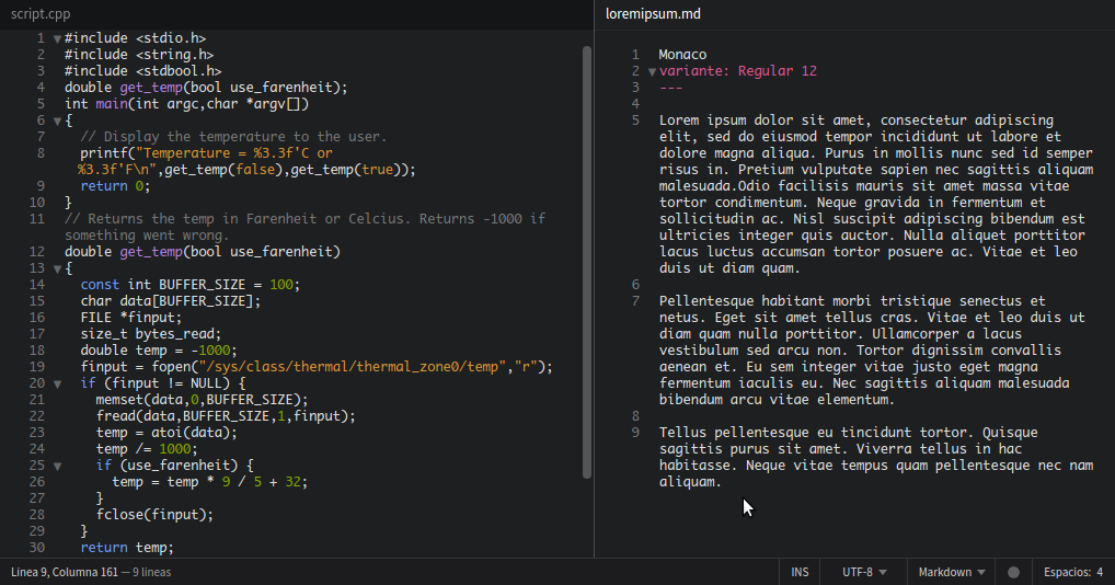
‘Monaco’
Propietaria; viene por defecto con la terminal de ‘OS X’.
«Monaco is a monospaced sans-serif typeface designed by Susan Kare, Kris Holmes, and Charles Bigelow and published by Apple Inc. Monaco 13.0d1e2 came built-in with macOS High Sierra and subsequently macOS Mojave.
Characters are distinct, and it is difficult to confuse 0 (figure zero) and O (uppercase O), or 1 (figure one), | (vertical bar), I (uppercase i) and l (lowercase L). A unique feature of the font is the high curvature of its parentheses as well as the width of its square brackets, the result of these being that an empty pair of parentheses or square brackets will strongly resemble a circle or square, respectively.
Monaco has been released in at least three forms. The original was a bitmap monospace font that still appears in the ROMs of even New World Macs, and is still available in recent macOS releases (size 9, with disabled antialiasing). The second is the outline form, loosely similar to Lucida Mono and created as a TrueType font for System 6 and 7; this is the standard font used for all other sizes. There was briefly a third known as MPW, since it was designed to be used with the Macintosh Programmer’s Workshop IDE; it was essentially a straight conversion of the bitmap font into an outline font with the addition of some of the same disambiguation features as were added to the TrueType Monaco.
The original Monaco 9 point bitmap font was designed so that when a Compact Macintosh window was displayed full screen, such as for a terminal emulator program, it would result in a standard text user interface display of 80 columns by 25 lines.
With the August 2009 release of Mac OS X 10.6 “Snow Leopard”, Menlo was introduced as the default monospaced font instead of Monaco in Terminal and Xcode. However, Monaco remains a part of macOS. Monaco is the default font in the current Python IDLE when used on a Mac running OS X El Capitan.»
‘San Francisco Mono’
‘San Francisco Mono’
descargar ‘San Francisco Mono’
descargar ‘San Francisco Mono’
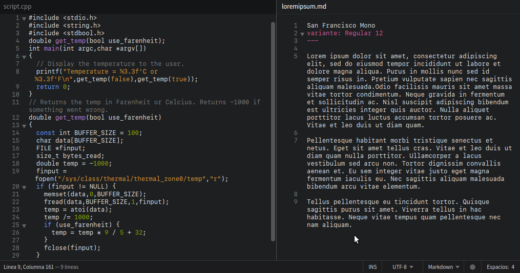
‘San Francisco Mono’
Propietaria; sólo se consigue habiendo pagado una licencia como ‘Apple Developer’ o teniendo ‘OS X El Capitan’ o superior. No obstante en macOS Sierra, esta tipografía está incluída dentro de la aplicación de la Terminal. La fuente ‘San Francisco Mono’ se puede extraer del sistema operativo macOS siguiendo el procedimiento que se detalla Simon Fredsted en su blog pdf.
«This monospaced variant of San Francisco enables alignment between rows and columns of text, and is used in coding environments like Xcode. It supports Latin, Greek, and Cyrillic scripts and contains six weights in upright and italic.
At WWDC 2016, Apple unveiled a brand new font which was called San Francisco. The font went on to become the default font in macOS and iOS, replacing Helvetica (which replaced Lucida Sans). On watchOS, a special Compact variant of San Francisco, was used.
Later, Apple introduced yet another variant, a monospaced varian»
‘Fira Code’
‘Fira Code’
descargar ‘Fira Code’
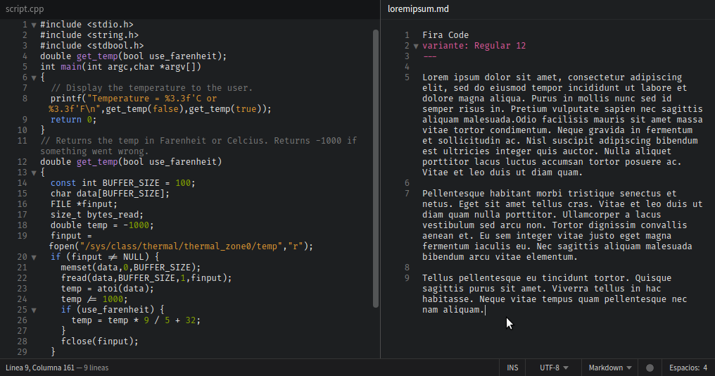
‘Fira Code’
«Tipografía monoespaciada desarrollada por Mozilla. Es de código abierto (open source). Posee una amplia gama de ligaduras, puntuación dependiente del contexto y una gran cantidad de símbolos ASCII y matemáticos.
Las ligaduras de programación sirven para mostrar el operador ‘->’ como un único carácter (una flecha en este caso), lo cual ahorra tiempo y facilita la lectura del código. Las ligaduras han de activarse en el propio editor de código.
Esta tipografía está presente en los repositorios de muchas distribuciones GNU Linux.»
En Debian y derivados se puede instalar -a parte de manualmente, así:
sudo apt-get update
sudo apt install fonts-firacode
‘Cascadia Code’
‘Cascadia Code’
descargar ‘Cascadia Code’
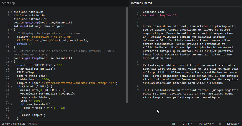
‘Cascadia Code’
Es una tipografía monoespaciada open source diseñada específicamente para su uso en terminales de línea de comandos y en editores de texto que fue lanzada por Microsoft en uno de sus últimos eventos Build.
‘Cascadia Code’ incorpora, al igual que ‘Fira Code’ e ‘Iosevka’, ligaduras. La versión ‘Cascadia Mono’ no incluye ligaduras.
‘Iosevka’
‘Iosevka’
‘Iosevka’ - gitHub
descargar ‘Iosevka’
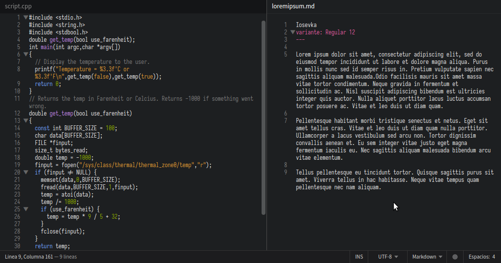
‘Iosevka’
Es una tipografía de código abierto que consta de 15 variantes san serif y 15 variantes slab serif. Incorpora -al igual que ‘Cascadia Code’ y ‘Fira Code’- ligaduras, aunque éstas están “deshablitidadas” en las variantes ‘Iosevka Term’ e ‘Iosevka Fixed’, que están especialmente diseñadas para su uso en línea de comandos.
Las variantes ‘Iosevka Aile’, ‘Iosevka Etoile’ e ‘Iosevka Sparkle’ -enfocadas a la redacción de documentación técnica- no son monoespaciadas, sino semiproporcionales.
‘Hack’ / ‘Hæck’
Es de código abierto y ha sido desarrollada para optimizar su legibilidad en pantalla aún cuando el tamaño sea pequeño. Compatible con el alfabeto de multitud de idiomas, en GNU Linux se puede instalar manualmente o bien, en la mayoría de distribuciones, a partir de respositorios oficiales.
‘Hack’ es una fuente sin ligaduras. ‘Hæck’, es la versión -fork- con ligaduras.
‘Hack’
‘Hack’
‘Hack’
descargar ‘Hack’
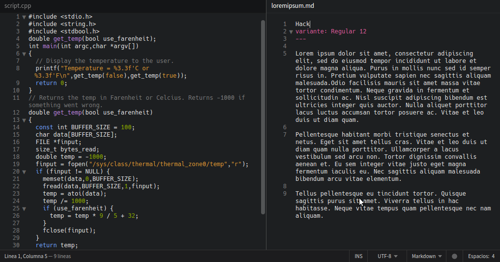
‘Hack’
En Debian y derivados la instalación de la tipografía ‘Hack’ mediante repositorio oficial es así:
sudo apt-get update
sudo apt install fonts-hack-ttf
‘Hæck’
Es el fork de ‘Hack’ con ligaduras
‘Hæck’
descargar ‘Hæck’
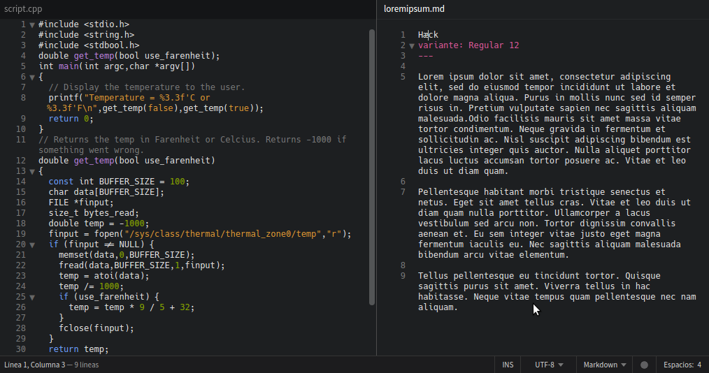
‘Hæck’
‘Crystal Font’
‘Crystal Font’
descargar ‘Crystal Font’
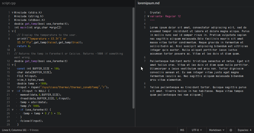
‘Crystal Font’
«Tiene un ancho fijo que, aunque es reducido, mantiene la facilidad de la lectura del código. Los caracteres de esta fuente tienen una forma alargada con bordes moderadamente curvados, en tamaños de 10 o 12 pixeles se aprecia de forma agradable a la vista.»
‘Proggy Clean’
‘Proggy Clean’
‘Proggy Clean’ - gitHub
descargar ‘Proggy Clean’

‘Proggy Clean’
«Es una fuente monoespaciada compacta que permite aprovechar al máximo el espacio sin que la facilidad de lectura se resienta.
Monospaced fonts for programming. The fonts are all fixed-width and designed for programming. They were optimized while writing C or C++. For this reason, characters like the ‘’ are vertically centered as ‘’ usually means dereference or multiply, but never ‘to the power of’ like in Fortran.
The {}s are centered horizontally (in case you align braces vertically), the zero looks different from the capital oh, and there is never any confusion between ells, ones, and eyes.
Additionally, the arithmetic operators (+ - * < >) are all axis-aligned… unlike the last ones you just saw.»
En 2019 desarrollaron una versión ‘vector (scalable)’ de la variante ‘Proggy Clean Slashed-Zero’. «Proggy Vector comes in woff, svg, eot, ttf (with Mac variants), and otf (with Mac variants).
There are also two variants of Proggy Vector. The first is Proggy Dotted. It is a conversion of Proggy Clean with the dotted zero. The second is Proggy Crossed with crossed sevens and zeds.
Proggy Vector Regular is a modified version of the Hack Font. The modifications were made using the Bird Font editor. Both the modifications made by SourceFoundry for Hack and my subsequent modifications are licensed under MIT. However, Hack started life out elsewhere, so please read the licensing information in ProggyVector_Readme_And_Licensing.txt. There’s nothing arduous.
The web format woff file was generated by importing the otf into FontForge and exporting. I have also included the BirdFont (.birdfont) project file in case anyone would like to make further edits.
Windows appears to do a better job rendering ttf fonts over otf versions (even though otf supports cubic beziers which should not be approximations of the authored curves). Point size 10 of the ttf works well for me in Visual Studio.»
‘Dina Programming Font’
‘Dina Programming Font’
descargar ‘Dina Programming Font’
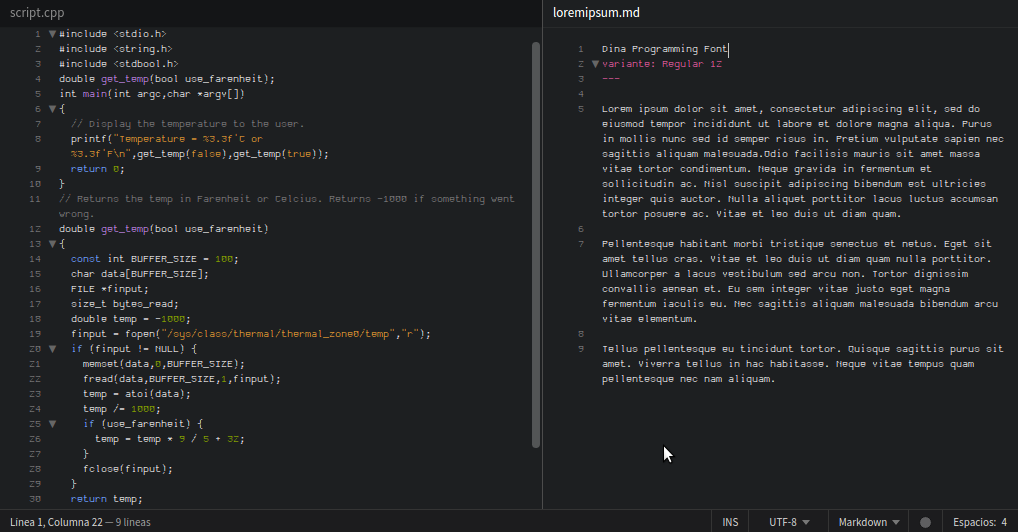
‘Dina Programming Font’
«Dina es una fuente que fue creada con el objetivo de ser adecuada para programar, el autor menciona que después de haber probado todas la fuentes gratuitas y notar que con ninguna fuente podía sentirse cómodo al trabajar a largo plazo decidió crearla basándose en la fuente ‘Proggy’ e inspirándose en las fuentes ‘Tobi’, ‘Fixedsys’ y algunas viejas fuentes DOS.
Dina es una fuente con un aspecto tradicional, podría decirse, una fuente esbelta que permite una lectura excelente aunque sea en dispositivos de alta resolución. Los caracteres son de aspecto uniforme, permite fácilmente identificar números y símbolos especiales.
Dina is a monospace bitmap font, primarily aimed at programmers. It is relatively compact to allow a lot of code on screen, while (hopefully) clear enough to remain readable even at high resolutions.
I made this font after having tried all the free programming fonts I could find. Somehow there was some detail in each of them that meant I couldn’t work with them in the long run.»
‘Raize Font’
‘Raize Font’
descargar ‘Raize Font’
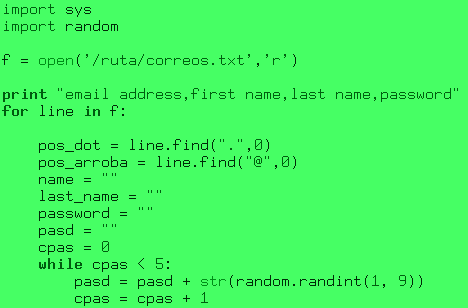
‘Raize Font’
«Esta fuente es delgada, limpia y de caracteres un tanto anchos, que recuerda a los caracteres de las terminales MS-DOS o la terminal de Windows pero con un cambio en el espesor que la hacer ser fácil de leer.
The Raize Font is a clean, crisp, fixed-pitched sans serif screen font that is much easier to read than the fixed pitched fonts that come with Windows. Ideally suited for programming, scripting, html writing, etc., the Raize Font can be used in any IDE or text editor.
The Raize Font supports the following sizes: 10, 12, and 14 points. The sample below illustrates the 10 point version.
The latest version refines the typeface of many characters, adds full ANSI character support, and introduces a new 14 point version ideal for displaying source code during presentations.
Graeme Geldenhuys (graeme@mastermaths.co.za) has created a version of the Raize Font for use in Linux. (Please note that the Linux version currently only includes the 10 pt font size.)»
‘Terminus’
‘Terminus’
Terminus - ttf “fork”
descargar ‘Terminus’
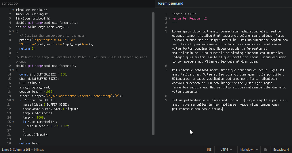
‘Terminus’
«Una de mis fuentes favoritas para programar, a mi personal opinión tienen el ancho adecuado para permitir ver los caracteres juntos cuando hacen una palabra clave o una linea de comandos y permite identificar claramente los espacios en blanco aun cuando existan puntos, comas o cualquier otro símbolo especial. Algo que me agrada de esta fuente es que tiene paquetes .deb para instalarla sin problema en Ubuntu y Linux Mint.»
«Terminus Font is a clean, fixed width bitmap font, designed for long (8 and more hours per day) work with computers. Version 4.49.1 contains 1356 characters, covers about 120 language sets and supports ISO8859-1/2/5/7/9/13/15/16, Paratype-PT154/PT254, KOI8-R/U/E/F, Esperanto, many IBM, Windows and Macintosh code pages, as well as the IBM VGA, vt100 and xterm pseudographic characters.
Sizes: 6x12, 8x14, 8x16, 10x18, 10x20, 11x22, 12x24, 14x28 and 16x32.
Weights: normal and bold (except for 6x12), plus CRT VGA-bold for 8x14 and 8x16.»
Es posible que en la mayoría de sistemas GNU Linux la tipografía ‘Terminus’ se pueda instalar desde repositorio oficial. En Debian y derivados, además, existen paquetes ‘.deb’.
Asimismo existe un fork llamado Terminus TTF que puede descargarse desde aquí.
Lorem ipsum dolor sit amet, consectetur adipiscing elit, sed do eiusmod tempor incididunt ut labore et dolore magna aliqua. Purus in mollis nunc sed id semper risus in. Pretium vulputate sapien nec sagittis aliquam malesuada. Odio facilisis mauris sit amet massa vitae tortor condimentum. Neque gravida in fermentum et sollicitudin ac. Nisl suscipit adipiscing bibendum est ultricies integer quis auctor. Nulla aliquet porttitor lacus luctus accumsan tortor posuere ac. Vitae et leo duis ut diam quam. Pellentesque habitant morbi tristique senectus et netus. Eget sit amet tellus cras. Vitae et leo duis ut diam quam nulla porttitor. Ullamcorper a lacus vestibulum sed arcu non. Tortor dignissim convallis aenean et. Eu sem integer vitae justo eget magna fermentum iaculis eu. Nec sagittis aliquam malesuada bibendum arcu vitae elementum. Tellus pellentesque eu tincidunt tortor. Quisque sagittis purus sit amet. Viverra tellus in hac habitasse. Neque vitae tempus quam pellentesque nec nam aliquam.
Entradas relacionadas:
— — —
Fuentes:
logico.ar
GenBeta
ComoInstalarLinux - tipografías programación
LaboratorioLinux - tipografías programación
coding-fonts
lowing.org
LaboratorioLinux - howto tipografía Anonymous
ComoInstalarLinux - howto tipografía inconsoalata

--- --- ---
COMENTARIOS
Este blog no cuantifica ni monetiza al visitante. Sean muchos, sean pocos, no me importan esos detalles, de dónde vienen o a dónde van; lo que aquí se expone está escrito por puro placer. Este blog prefiere sacrificar un sistema de comentarios cómodo en pro de la privacidad del visitante. Incorporar sistemas de comentarios como 'Disqus' u otros suministra telemetría a terceros, es contrario a la privacidad y una falta de respeto al lector.
✉ Siéntanse libres de comentar, corregir o comunicar. Para ello pueden dirigirme un correo electrónico a hijosdeinit@protonmail.com. Pronto o tarde, siempre respondo.
♫ hijosdeinit - Canal de video en Odysee/lbry
♪ hijosdeinit - Podcast (en construcción)